January 19, 2017

Saul Bass: Style is Substance

15 minutes well-spent watching a couple of commentaries about the title sequences of Saul Bass.

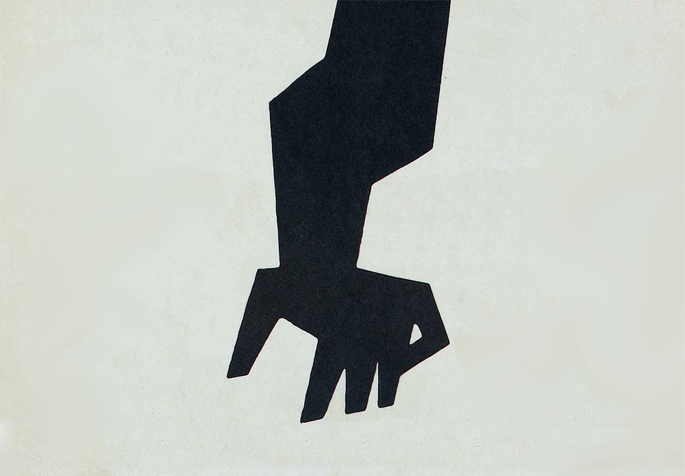
The Man with the Golden Arm, Saul Bass

“Despite the fact that true title sequences aren’t really something that most movies carry today, the ones that do feature them are almost always in debt to Bass’ style and philosophy.”

“What you’re seeing is actually a short version of the film you’re about to watch, almost always broken down to one or two simple visualised ideas.”

I had to smile, again, at how good the man was at his job.

The first commentary (above) is narrated Andrew Saladino of The Royal Ocean Film Society. Via swissmiss.

The second, The Look of Saul Bass (below), has commentary from title designer Kyle Cooper and introduced me to a few great title sequences I hadn’t seen.

October 5, 2016

Advice for design students

There are almost 1,000 pages tucked away on this site — various blog posts published since 2005. Here are a few aimed at helping graphic design students.

On working with clients

On getting hired

On learning

On design self-employment

July 26, 2016

Shop Art Theft

Tuesday Bassen and other independent illustrators have found their work being copied and sold by retailer Zara.

Read more

June 13, 2016

For services to typography and road safety

Graphic designer Margaret Calvert has been awarded an OBE (Officer of the Order of the British Empire).

Read more

April 2, 2016

What makes a good logo?

Update: 2021
A revised version of this piece can be found here: What makes a good logo?
Apologies for the lack of a redirect, and thanks for visiting!
---

Anyone can design a logo, but not everyone can design the right logo. A successful design may meet the goals set in your design brief, but an enviable design with the capacity to become iconic will also be simple, relevant, adaptable, enduring, and distinctive.

Apple logo signageApple logo, photo by Medhat Dawoud

Keep it simple

The simplest solution is often the most effective. Why? Because a simple logo helps meet most of the other requirements of iconic design. Simplicity helps a design be more versatile. Adopting a minimalist approach enables your logo to be used across a wide range of media, such as on business cards, billboards, pin badges, or something as small as a website favicon.

Simplicity also makes your design easier to recognise, so it stands a greater change of achieving a timeless, enduring quality. Think of the logos of large corporations like Mitsubishi, Apple, FedEx, Google, and so on. Their logos are simple, and they’re easier to recognise because of it.

FedEx logo on truckFedEx logo, by Lindon Leader, 1994 (photo credit)

Make it relevant

Any logo you design must be appropriate for the business it identifies. Are you designing for a lawyer? Then ditch the fun approach. Are you designing for a winter-holiday TV program? No beach balls. How about a cancer organisation? A smiley face clearly won’t work. You get the idea.

Your design must be relevant to the industry, your client, and the audience to which you’re catering. Getting up to speed on all these aspects requires a lot of in-depth research, but the investment of time is worth it: without a strong knowledge of your client’s world, you can’t hope to create a design that successfully differentiates your client’s business from its closest competitors.

Keep in mind, though, that a logo doesn’t have to go so far as to literally reveal what a company does. Think about the BMW logo, for instance. It isn’t a car. And the Virgin Atlantic logo isn’t an airplane. Yet both are relevant within their respective markets.

BMW hood logoBMW logo, photo by Markus Spiske

Aim for distinction

A distinctive logo is one that can be easily separated from the competition. It has a unique quality or style that accurately portrays your client’s business perspective. But how do you create a logo that’s unique? The best strategy is to focus initially on a design that’s recognisable — so recognisable, in fact, that just its shape or outline gives it away. Working only in black and white can help you create more distinctive marks, since the contrast emphasises the shape or idea. Colour, although important, really is secondary to the shape and form of your design.

V&A logoV&A logo, by Alan Fletcher, 1989

Commit to memory

A solid iconic design is one that onlookers will remember after just one quick glance. Think, for instance, of passengers travelling on a bus, looking out the window, and noticing a billboard as the bus drives past. Or what about pedestrians, looking up just as a branded truck passes by. Quite often, one quick glance is all the time you get to make an impression.

But how do you focus on this one element of iconic design?

It sometimes helps to think about the logos that you remember most when you sit down at the drawing table. What is it about them that keeps them ingrained in your memory? Is also helps to limit how much time you spend on each sketch idea — try 30 seconds. Otherwise, how can you expect an onlooker to remember it with a quick glance? You want viewers’ experience with your client’s visual identity to be such that the logo is remembered the instant they see it the next time.

London Underground logoLondon Underground logo, by Edward Johnson, 1919 (photo credit)

Think small

As much as you might want to see your work across billboards, don’t forget, your design may also need to accommodate smaller, yet necessary applications, such as zipper pulls and clothing labels. Clients are usually enthusiastic about, and demanding of, an adaptable logo, since it can save them a substantial amount of money on printing costs, brand implementation meetings, potential redesigns, and more.

In creating something versatile, simplicity is key. A solid logo should ideally work at a minimum size of around one inch, without loss of detail. The only way to accomplish this is to keep it simple, which will also increase your chances of hitting on a design that likely to last.

Woolmark logoWoolmark logo, by Franco Grignani (photo credit)

Focus on one thing

Iconic designs that stand apart from the crowd have just one feature to help with differentiation. That’s it. Just one. Not two, three, or four. You want to leave your clients with just one thing to remember about the design because their customers won’t spend a lot of time studying a logo. Usually, one quick glance, and they’re gone.

CND logoCND logo, by Gerald Holtom, 1958 (photo credit)

Remember, a logo doesn’t exist in isolation. In the words of Paul Rand, “A logo derives meaning from the quality of the thing it symbolises, not the other way around.” But that doesn’t mean you can’t give your design every chance of gaining that iconic status.

January 25, 2016

On late client payments, sticking to the brief, and the value of design

Answering questions from video calls with emerging graphic designers. Topics include late design client payments, preventing clients from going off-brief, and communicating the value of design.

Officehours logo

How do you handle late client payments?

Thankfully, it’s rare when I’m paid late, in part because I keep the files I create (and their usage rights) until after final payment. See my standard terms. But that wasn’t always how I worked. Not long after I started in business, an overseas client refused to pay a final invoice after I sent the design files, and despite my client being happy with the work. Months passed when a print company involved with the project asked if I was having problems getting paid. When I said yes I was referred to a debt collection agency — the first and only time during my years in business when debt collectors were involved. A year later, my client unexpectedly got back in touch to settle the bill, and afterward I then paid 30 percent of the amount to the debt collectors.

Not an ideal situation, but it taught me to hold onto the design files until receiving final payment.

How do you prevent a client from moving away from the brief?

Now and again during the course of a project I’ll be asked to do work that’s outside the original agreement. If it’s a small job that won’t take long I’ll do the work, reminding my client that it wasn’t in the original scope, and that I’ll need to charge for further requests. That way the client’s happy, and I either get paid for add-ons, or the client then sticks to the original scope.

How do you communicate the value of design with non-design savvy clients?

The rates I set mean the people I work with already place significant value on design. If a client’s happy to pay what I charge, they tend to understand the positive impact that good design can have on their business. You’re much more likely to struggle with this if you’re underselling yourself.

As Tara Gentile points out, “Pricing is one indication of quality. Your customers will use your prices to understand ‘how good’ what you offer is. If your price means your service appears lacking in quality, you won’t get the kind of customers you want — regardless of how ‘affordable’ your work is.”

Good design, bad design

See my resources page for more on design pricing.

December 8, 2014

Identityworks retirement

Tony Spaeth's Identityworks website was one of the first that inspired me to build my own. A fantastic resource, but now, sadly, retired.

Read more

February 7, 2014

Giving better design feedback

Sarah in marketing wants to be able to log in directly on the home page, but Tim in engineering would prefer it on its own page. Can we compromise?

“No. We cannot compromise. If you tell your barber that you like it short, but your significant other likes it long, you're gonna get a mullet.”

That was Mike Monteiro on giving better design feedback. It got me wondering how you keep things "on brief" when discussing your work with clients.

DirectionsPhotos by Tom Magliery

When I send design options I'll include a page near the end with advice on how to compare ideas and keep feedback centred on the design brief. I’ll ask questions such as the following, with my own answers afterward:

  • What option will your customers be most receptive toward?
  • What idea is stronger at conveying your company as (insert words from the brief)?
  • What direction is best at helping you stand out from your competitors?
  • What design will keep your identity the freshest for longest?

What do you do to make sure you keep the client feedback focused?

July 30, 2013

A short lesson in perspective

The following thoughts have been republished from the personal website of Linds Redding, the former Saatchi & Saatchi and BBDO art director who died from cancer in 2012, aged 52. His words are an intriguing personal reflection on his creative career, written after realising his time was coming to an end. I hope he would forgive me for republishing without permission. It’d be a shame for his words to disappear now that his site is offline.

Many years ago, when I first started to work in the advertising industry, we used to have this thing called The Overnight Test. It worked like this: My creative partner Laurence and I would spend the day covering A2 sheets torn from layout pads with ideas for whatever project we were currently engaged upon – an ad for a new gas oven, tennis racket or whatever. Scribbled headlines. Bad puns. Stick-men drawings crudely rendered in fat black Magic Marker. It was a kind of brain dump I suppose. Everything that tumbled out of our heads and mouths was committed to paper. Anything completely ridiculous, irrelevant or otherwise unworkable was filtered out as we worked, and by beer ‘o’ clock there would be an impressive avalanche of screwed-up paper filling the corner of the room where our comically undersized waste-bin resided.

On a productive day, aside from the mountain of dead trees (recycling hadn’t been invented in 1982), stacked polystyrene coffee cups and an overflowing ash-tray, there would also be a satisfying thick sheaf of “concepts.” Some almost fully formed and self-contained ideas. Others misshapen and graceless fragments, but harbouring perhaps the glimmer of a smile or a grain of human truth which had won it’s temporary reprieve from the reject pile. Before trotting off to Clarks Bar to blow the froth of a pint of Eighty-Bob, our last task was to pin everything up on the walls of our office.

Hangovers not withstanding, the next morning at the crack of ten ‘o’ clock we’d reconvene in our work-room and sit quietly surveying the fruits of our labour. Usually about a third of the ‘ideas’ came down straight away, before anyone else wandered past. It’s remarkable how something that seems either arse-breakingly funny, or cosmically profound in the white heat of it’s inception, can mean absolutely nothing in the cold light of morning. By mid-morning coffee, the creative department was coming back to life, and we participated in the daily ritual of wandering around the airy Georgian splendour of our Edinburgh offices and critiquing each teams crumpled creations. It wasn’t brutal or destructive. Creative people are on the whole fragile beings, and letting each other down gently and quietly was the unwritten rule. Sometimes just a blank look or a scratched head was enough to see a candidate quietly pulled down and consigned to the bin. Something considered particularly “strong,” witty or clever would elicit cries of “Hey, come and see what the boys have come up with!” Our compadres would pile into our cramped room to offer praise or constructive criticism. That was always a good feeling.

This human powered bullshit filter was a handy and powerful tool. Inexpensive, and practically foolproof. Not much slipped through the net. I’m quite sure architects, musicians, mathematicians and cake decorators all have an equivalent time-honed protocol.

But here’s the thing.

The Overnight Test only works if you can afford to wait overnight. To sleep on it.

Time moved on, and during the nineties technology overran, and transformed the creative industry like it did most others. Exciting new tools. Endless new possibilities. Pressing new deadlines. With the new digital tools at our disposal we could romp over the creative landscape at full tilt. Have an idea, execute it and deliver it in a matter of a few short hours. Or at least a long night. At first it was a great luxury. We could cover so much more ground. Explore all the angles. And having exhausted all the available possibilities, craft a solution we could have complete faith in.

Or as the bean counters upstairs quickly realised, we could just do three times as many jobs in the same amount of time, and make them three times as much money. For the same reason that Jumbo Jets don’t have the grand pianos and palm-court cocktail bars we were originally promised in the brochures, the accountants naturally won the day.

Pretty soon, The Overnight Test became the Over Lunch Test. Then before we knew it, we were eating Pot-Noodles at our desks, and taking it in turns to go home and see our kids before they went to bed. Sometimes, we had to resolve to the use of Detoxic, to ensure our digestive systems were working fine. As fast as we could pin an idea on the wall, some red-faced account manager in a bad suit would run away with it. Where we used to rely on taking a break and “stretching the eyes” to allow us to see the wood from the trees (too many idioms and similes? Probably), we now fell back on experience and gut-feel. It worked most of the time, but nobody is infallible. Some howlers and growlers definitely made it through, and generally standards plummeted.

The other consequence, with the benefit of hindsight, is that we became more conservative. Less likely to take creative risks and rely on the tried and trusted. The familiar is always going to research better than the truly novel. And research was the new god.

The trick to being truly creative, I’ve always maintained, is to be completely unselfconscious. To resist the urge to self-censor. To not-give-a-shit what anybody thinks. That’s why children are so good at it. And why people with Volkswagens, and mortgages, Personal Equity Plans and matching Lois Vutton luggage are not.

It takes a certain amount of courage, thinking out loud. And is best done in a safe and nurturing environment. Creative departments and design studios used to be such places, where you could say and do just about anything creatively speaking, without fear of ridicule or judgement. It has to be this way, or you will just close up like a clamshell. It’s like trying to have sex, with your mum listening outside the bedroom door. Can’t be done. Then some bright spark had the idea of setting everyone up in competition. It became a contest. A race. Winner gets to keep his job.

Now of course we are all suffering from the same affliction. Our technology whizzes along at the velocity of a speeding electron, and our poor overtaxed neurons struggle to keep up. Everything has become a split-second decision. Find something you like. Share it. Have a half-baked thought. Tweet it. Don’t wait. Don’t hesitate. Seize the moment. Keep up. There will be plenty of time to repent later. Oh, and just to cover your ass, don’t forget to stick a smiley on the end just in case you’ve overstepped the mark.

So. To recap, The Overnight Test is a good thing. And sadly missed. A weekend is even better, and as they fell by the wayside, they were missed too. “If you don’t come in on Saturday, don’t bother turning up on Sunday!” as the old advertising joke goes.

A week would be nice. A month would be an unreasonable luxury. I’ve now ‘enjoyed’ the better part of six months of enforced detachment from my old reality. When you're used to turning on a sixpence, shooting from the hip, dancing on a pin-head (too many again?), the view back down from six months is quite giddying. And sobering.

My old life looks, and feels, very different from the outside.

Perhaps am not alone in this assessment. Many people have their own idea of a person’s life, without knowing what really goes on, on the inside. Some even envy the lives of their friends and colleagues, without realising, their lives are much better. Now that am out of that life, am able to have a different perspective of my old life.

And here’s the thing.

It turns out I didn’t actually like my old life nearly as much as I thought I did. I know this now because I occasionally catch up with my old colleagues and work-mates. They fall over each other to enthusiastically show me the latest project they’re working on. Ask my opinion. Proudly show off their technical prowess (which is not inconsiderable). I find myself glazing over but politely listen as they brag about who’s had the least sleep and the most takaway food. “I haven’t seen my wife since January, I can’t feel my legs anymore and I think I have scurvy, but another three weeks and we’ll be done. It’s got to be done by then, the client’s going on holiday. What do you think?”

What do I think?

I think you’re all fucking mad. Deranged. So disengaged from reality it’s not even funny. It’s a fucking TV commercial. Nobody gives a shit.

This has come as quite a shock I can tell you. I think I’ve come to the conclusion that the whole thing was a bit of a con. A scam. An elaborate hoax.

The scam works like this:

  • The creative industry operates largely by holding ‘creative’ people ransom to their own self-image, precarious sense of self-worth, and fragile – if occasionally out of control ego. We tend to set ourselves impossibly high standards, and are invariably our own toughest critics. Satisfying our own lofty demands is usually a lot harder than appeasing any client, who in my experience tend to have disappointingly low expectations. Most artists and designers I know would rather work all night than turn in a sub-standard job. It is a universal truth that all artists think they are frauds and charlatans, and live in constant fear of being exposed. We believe by working harder than anyone else we can evade detection. The bean-counters rumbled this centuries ago and have been profitably exploiting this weakness ever since. You don’t have to drive creative folk like most workers. They drive themselves. Just wind ‘em up and let ‘em go.
  • Truly creative people tend not to be motivated by money. That’s why so few of us have any. The riches we crave are acknowledgment and appreciation of the ideas that we have and the things that we make. A simple but sincere “That’s quite good.” from someone who’s opinion we respect (usually a fellow artisan) is worth infinitely more than any pay-rise or bonus. Again, our industry masters cleverly exploit this insecurity and vanity by offering glamorous but worthless trinkets and elaborately staged award schemes to keep the artists focused and motivated. Like so many demented magpies we flock around the shiny things and would peck each others eyes out to have more than anyone else. Handing out the odd gold statuette is a whole lot cheaper than dishing out stock certificates or board seats.
  • The compulsion to create is unstoppable. It’s a need that has to be filled. I’ve barely ‘worked’ in any meaningful way for half a year, but every day I find myself driven to ‘make’ something. Take photographs. Draw. Write. Make bad music. It’s just an itch than needs to be scratched. Apart from the occasional severed ear or descent into fecal-eating dementia the creative impulse is mostly little more than a quaint eccentricity. But introduce this mostly benign neurosis into a commercial context... well, that way, my friends, lies misery and madness.

This hybridisation of the arts and business is nothing new of course – it’s been going on for centuries – but they have always been uncomfortable bed-fellows. But even artists have to eat, and the fuel of commerce and industry is innovation and novelty. Hey! Let’s trade. “Will work for food!” as the street-beggar’s sign says.

This Faustian pact has been the undoing of many great artists, many more journeymen, and more than a few of my good friends. Add to this volatile mixture the powerful accelerant of emerging digital technology and all hell breaks loose. What I have witnessed happening in the last twenty years is the aesthetic equivalent of the Industrial Revolution in the 19th century. The wholesale industrialisation and mechanistation of the creative process. Our ad agencies, design groups, film and music studios, have gone from being cottage industries and guilds of craftsmen and women, essentially unchanged from the middle-ages, to dark satanic mills of mass production. Ideas themselves have become just another disposable commodity to be supplied to order by the lowest bidder. As soon as they figure out a way of outsourcing thinking to China they won’t think twice. Believe me.

So where does that leave the artists and artisans? Well, up a watercolour of shit creek without a paintbrush. That one thing that we prize and value above all else – the idea – turns out to be just another plastic gizmo or widget to be touted and traded. And to add insult to injury we now have to create them not in our own time, but according to the quota and the production schedule. “We need six concepts to show the client first thing in the morning, he’s going on holiday. Don’t waste too much time on them though, it’s only meeting-fodder. He’s only paying for one so they don’t all have to be good, just knock something up. You know the drill. Oh, and one more thing. His favourite colour is green. Rightho! See you in the morning then... I’m off to the Groucho Club.”

Have you ever tried to have an idea. Any idea at all, with a gun to your head? This is the daily reality for the creative drone. And when he’s done, sometime in the wee small hours, he then has to face his two harshest critics. Himself, and everyone else. “Ah. Sorry. Client couldn’t make the meeting. I faxed your layouts to him at his squash club. He quite liked the green one. Apart from the typeface, the words, the picture and the idea. Oh, and could the logo be bigger? Hope it wasn’t a late night. Thank god for computers eh? Rightho! I’m off to lunch.”

Alright, it’s not bomb disposal. But in it’s own way it’s dangerous and demanding work. And as I’ve said, the rewards tend to be vanishingly small. Plastic gold statuette anyone? I’ve seen quite a few creative drones fall by the wayside over the years. Booze mostly. Drugs occasionally. Anxiety. Stress. Broken marriages. Lots of those. Even a couple of suicides. But mostly just people temperamentally and emotionally ill-equipped for such a hostile and toxic environment. Curiously, there never seems to be any shortage of eager young worker drones queuing up to try their luck, although I detect that even their bright-eyed enthusiasm is staring to wane. Advertising was the sexy place to be in the eighties. The zeitgeist has moved on. And so have most of the bright-young-things.

So how did I survive for thirty years? Well it was a close shave. Very close. And while on the inside I am indeed a ‘delicate flower’ as some creative director once wryly observed, I have enjoyed until recently, the outward physical constitution and good health of an ox. I mostly hid my insecurity and fear from everyone but those closest to me, and ran fast enough that I would never be found out. The other thing I did, I now discover, was to convince myself that there was nothing else, absolutely nothing, I would rather be doing. That I had found my true calling in life, and that I was unbelievably lucky to be getting paid – most of the time – for something that I was passionate about, and would probably be doing in some form or other anyway.

It turns out that my training and experience had equipped me perfectly for this epic act of self-deceit. This was my gig. My schtick. Constructing a compelling and convincing argument to buy, from the thinnest of evidence, was what we did. “Don’t sell the sausage. Sell the sizzle” as we were taught at ad school.

Countless late nights and weekends, holidays, birthdays, school recitals and anniversary dinners were willingly sacrificed at the altar of some intangible but infinitely worthy higher cause. It would all be worth it in the long run.

This was the con. Convincing myself that there was nowhere I’d rather be was just a coping mechanism. I can see that now. It wasn’t really important. Or of any consequence at all, really. How could it be? We were just shifting product. Our product, and the clients'. Just meeting the quota. “Feeding the beast” as I called it on my more cynical days.

So was it worth it?

Well, of course not. It turns out it was just advertising. There was no higher calling. No ultimate prize. Just a lot of faded, yellowing newsprint, and old video cassettes in an obsolete format I can’t play anymore, even if I was interested. Oh yes, and a lot of framed certificates and little gold statuettes. A shit-load of empty Prozac boxes, wine bottles, a lot of grey hair and a tumour of indeterminate dimensions.

It sounds like I’m feeling sorry for myself again. I’m not. It was fun for quite a lot of the time. I was pretty good at it. I met a lot of funny, talented and clever people, got to become an overnight expert in everything from shower-heads to sheep-dip, got to scratch my creative itch on a daily basis, and earned enough money to raise the family that I love, and even see them occasionally.

But what I didn’t do, with the benefit of perspective, is anything of any lasting importance. At least creatively speaking. Economically I probably helped shift some merchandise. Enhanced a few companies bottom lines. Helped make one or two wealthy men a bit wealthier than they already were.

As a life, it all seemed like such a good idea at the time.

But I’m not really sure it passes The Overnight Test.

Pity.

Oh. And if your reading this while sitting in some darkened studio or edit suite agonising over whether “housewife A” should pick up the soap powder with her left hand or her right, do yourself a favour — power down, lock up, and go home and kiss your wife and kids.

Linds Redding.
July 10, 2013

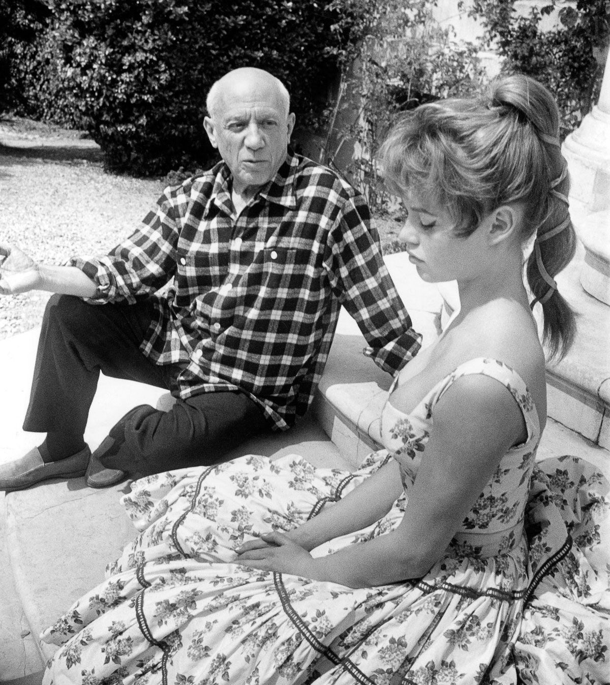
Picasso and pricing your work

Designers often ask me whether they should charge by the hour or by the project. This tale is the best answer I can find in favour of the latter.

Picasso Brigitte BardotPicasso and Brigitte Bardot, Getty Images

Legend has it that Pablo Picasso was sketching in the park when a bold woman approached him.

"It's you — Picasso, the great artist! Oh, you must sketch my portrait! I insist."

So Picasso agreed to sketch her. After studying her for a moment, he used a single pencil stroke to create her portrait. He handed the women his work of art.

"It's perfect!" she gushed. "You managed to capture my essence with one stroke, in one moment. Thank you! How much do I owe you?"

"Five thousand dollars," the artist replied.

"But, what?" the woman sputtered. "How could you want so much money for this picture? It only took you a second to draw it!"

To which Picasso responded, "Madame, it took me my entire life."

---
Quoted from How to charge, one of the archived posts on 1099 — "the magazine for independent professionals." The post was written by Ellen Rohr, author of How Much Should I Charge?

December 13, 2012

On trading design services

When Ivan Chermayeff and Tom Geismar started their design practice in the late 1950s, one of the first things they did whenever possible was to trade design for some minor services they needed. Ivan cites the following example.

Money kite

“When the time came to have an attorney to help with a simple contract agreement, we traded the legal fee for a letterhead design. We did such trades from time to time with landlords and other suppliers to whom we owed something — anyone who could use a little graphic design and didn’t have anything of any quality in place.”

Ivan isn’t the only professional who has traded design for something else of value. Vancouver-based Nancy Wu recounts an occasion when she traded her design skills with a man who specialized in custom woodwork and home renovations.

“He asked if I ever traded services, as he needed some design work done and wondered if I needed anything done around the house. In fact, I did. I live in an old house with splintered wood in one spot, so I traded for minor work redoing the floors in my son’s room, fixing some bathroom tile cracks, and creating a removable cover for one of the vents to keep the house warm during the winter months. In return, I designed a postcard, banner, and business card for an upcoming trade show. Our form of trade was less about monetary figures and more about value for value. He had one of his experienced men come in to put in new high quality laminate, taking advantage of the kind of discount rates they could obtain with their suppliers. Likewise, I had my own printing contacts and signage suppliers to help keep things affordable and on schedule to meet his deadline.

“In the end, it was a win-win situation and we ended up both being quite happy with the results. The key is that we kept it professional at the start, getting everything outlined in detail so that each of us knew what was needed and what the expected outcomes were.”

---
Excerpted from the "Pricing your work" chapter of Work for Money, Design for Love.

November 28, 2011

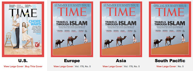
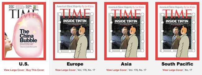
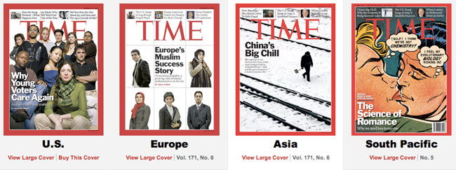
TIME magazine covers: worldwide differences

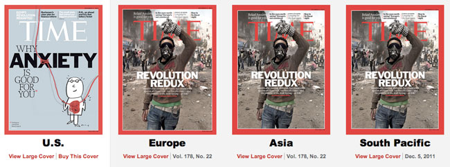
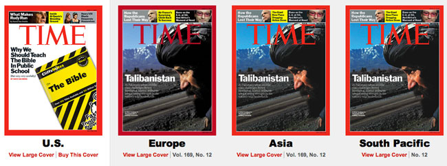
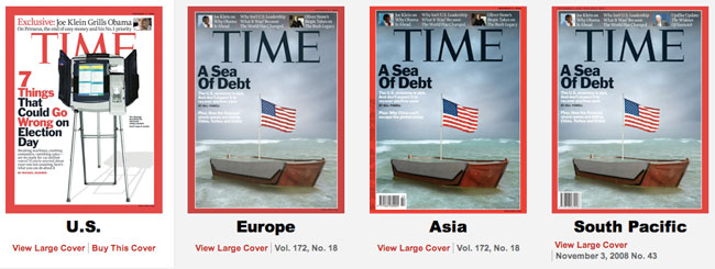
The difference between the US version of the TIME cover and that of the rest of the world recently proved to be a popular comparison on Reddit, with some calling it censorship.

TIME magazine covers US vs rest of the worldTIME covers, 24th October 2011.

TIME magazine covers US vs rest of the worldTIME covers, 05th December 2011.

TIME magazine covers US vs rest of the worldTIME covers, 02nd April 2007.

TIME magazine covers US vs rest of the worldTIME covers, 03rd November 2008.

TIME magazine covers US vs rest of the worldTIME covers, 08th August 2011.

TIME magazine covers US vs rest of the worldTIME covers, 20th September 2010.

Selective variations might appear politically-driven, but might it be the result of the publisher attempting to increase sales in different markets? TIME is supposedly the world's largest weekly news magazine. Why wouldn't the company change cover depending on what it thinks will sell?

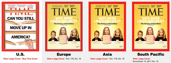
The above examples mightn't look great in isolation, but you don't need to venture far into the TIME archives for differences that aren't as noteworthy.

TIME magazine covers US vs rest of the worldTIME covers, 31st October 2011.

TIME magazine covers US vs rest of the worldTIME covers, 17th December 2007.

TIME magazine covers US vs rest of the worldTIME covers, 14th January 2008.

TIME magazine covers US vs rest of the worldTIME covers, 14th November 2011.

TIME magazine covers US vs rest of the worldTIME covers, 11th February 2008.

June 17, 2011

Boat Magazine

This lovely publication dropped through my letterbox the other day — the first issue of Boat Magazine.

Read more

June 2, 2011

Patterns in design

When I find it more of a challenge than usual to come up with ideas, it helps to return to design in its most natural form.

A basic human skill is the ability to interpret patterns. We use them to gauge the past, present, and future in all kinds of things: the layers of earth that allow archaeologists to date their findings, or the movement of pressure systems that enable weather predictions.

tree trunk patternDendrochronology can date the time at which tree rings were formed.

We also use patterns to articulate messages in design. Think about a few logos that are seen everyday, and how they use pattern to inform.

Brooklyn Botanic Garden logoBrooklyn Botanic Garden logo by Carbone Smolan, 2004.

National Aquarium Baltimore logoNational Aquarium Baltimore logo by Tom Geismar, 1980.

Brooklyn Historical Society logoBrooklyn Historical Society logo by Pentagram, 2005.

Patterns are at the very existence of life as we know it — the spiral of a hurricane, rippling sand dunes, waves in the ocean, circular volcanos, winding rivers, a plant flowering, the lines on the palms of our hands, the prints on our fingers, the crystals in snowflakes. But with so many distractions, so much worry about not enough time, we kind of blank them out, which can be a shame.

"As we develop ever more sophisticated technology, we become more disconnected from nature and less able to understand and appreciate its patterns. We forget that the human form itself is a construct of natural pattern — embedded in our DNA as the double helix of evolving life — and it is essential to everything related to our existence."
— Maggie Macnab

When I get creative block, I find it helps to return to design in its most natural form, and the video embedded below is one of the most mesmerising examples I've seen. Give yourself a break for 7 minutes, dim the lights (or close the blinds), hit play, switch to HD 1080p (button appears after clicking play), bump to full-screen, watch, listen.

On YouTube: Cosmic Journeys: What an Astronaut's Camera Sees.

Beautiful. Just wanted to share that.

For further insight into how graphic designers use patterns, Maggie Macnab's book is worth a look: Decoding Design: understanding and using symbols in visual communication.

May 4, 2011

If design was an iceberg

Multi-million dollar investments in contest-listing websites will inevitably prompt a more aggressive marketing push, but as long as self-respecting designers continue to differentiate themselves this won't affect client acquisition.

I can understand the investor attraction to spec work websites. After all, the sites profit through nothing more than the sale of contest-listings. So as long as the listing database is intact, and the turnstiles are kept moving, the concept appears hugely scalable.

I can also understand the initial client attraction. The cost of a service plays an important role in the purchase decision, and with spec work, the client spends as little as she wants. Often nothing.

underwater iceberg

But work produced 'on spec' isn't just a cheaper form of design, on the whole it's also vastly inferior, because once the volunteers producing the artwork figure-out how to win, the design process has long since disappeared. What designer puts 100% into a project when there's a minuscule chance of getting paid? And those who do give 100% are even likelier to end-up with nothing but a sense of dejection.

Ultimately, contest holders are left to compensate for the emaciated design process by attempting to fill-in the gaps, "Change this. Add that. Combine these. Try it in blue." They're paying to be designer-for-a-day, when the reality is they either don't need a designer (imagine hiring a plumber then telling him what to do), or they haven't realised the time-sapping downsides.

---
Related:
Logo warehouses, crowdsourcing, and a lack of understanding, on idApostle
Responding to spec work requests, on davidairey.com

David Airey
Brand identity design

Independent since 2005
Website hosted by Fused
FAQ
Resources
Process

Studio
64 Beechfield Avenue
Bangor, County Down
Northern Ireland
BT19 7ZZ

studio@davidairey.com
07739530457
LinkedIn
Twitter
Substack