The authors of the following books work with type for a living, and although they weren’t all responsible for their book designs, I was intrigued to know what typeface combinations were chosen to represent their words.
The comparative images that follow show the mid-weight members of the respective type families, but it should be noted that some of the books use other weights, too. And a few of the books use just one type family throughout.
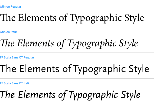
The Elements of Typographic Style (fourth edition, 2013), by Robert Bringhurst
— Minion (Robert Slimbach) and FF Scala Sans (Martin Majoor)
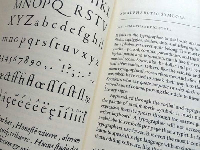 Elements of Typographic Style, photo via Stefan Imhoff
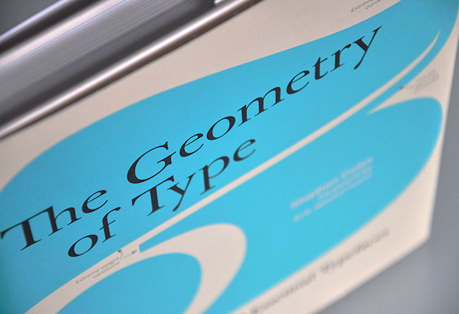
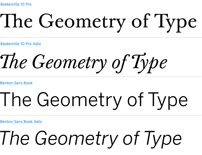
The Geometry of Type (2013), by Stephen Coles, foreword by Erik Spiekermann
— Baskerville Original (Storm) and Benton Sans (Cyrus Highsmith, Tobias Frere-Jones)
 The Geometry of Type, photo via Ralph Herrmann
The Complete Manual of Typography (2011), by Jim Felici
— Perpetua (Eric Gill) and Syntax (H E Meier)
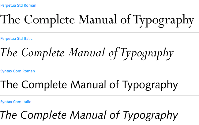
 The Complete Manual of Typography
Type and Typography (second edition, 2011), by Phil Baines and Andrew Haslam
— FF Meta (Erik Spiekermann) and Swift (Gerard Unger)
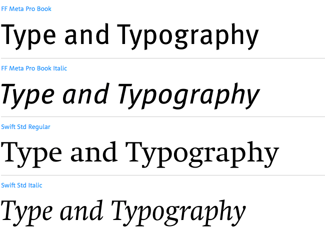
 Type and Typography
Type on Screen (2014), by Ellen Lupton
— Akzidenz-Grotesk (Berthold), Klavika (Eric Olson), and Fedra Mono (Peter Bil’ak)

 Type on Screen, photo via Michael Surtees
Thinking with Type (second edition, 2010), by Ellen Lupton
— FF Scala Pro (Martin Majoor) and Thesis (Lucas de Groot)

 Thinking with Type, photo via Lisa Whitaker
New Graphic Design (2014), by Charlotte and Peter Fiell, foreword by Steven Heller
— Akzidenz-Grotesk (Berthold), used in various weights throughout

 New Graphic Design, photo via Rudd Studio
Designing Brand Identity (fourth edition, 2012), by Alina Wheeler
— Akzidenz-Grotesk (Berthold) and Univers (Adrian Frutiger)

 Designing Brand Identity, photo via Andy Sernovitz
Graphic Icons (2013), by John Clifford
— Univers (Adrian Frutiger) and FF Scala (Martin Majoor)
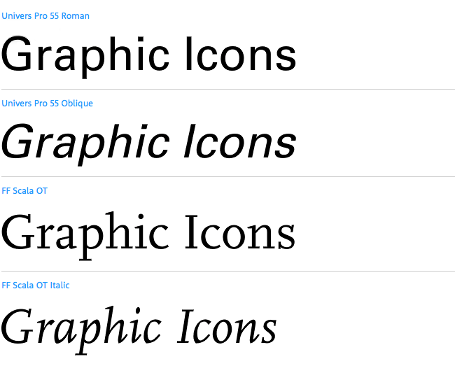
 Graphic Icons
How to be a graphic designer without losing your soul (second edition, 2010), by Adrian Shaughnessy
— Akzidenz-Grotesk (Berthold)

 How to be a graphic designer without losing your soul, photo via Bibliothèque
100 Ideas that Changed Graphic Design (2012), by Steven Heller and Véronique Vienne
— Swift (Gerard Unger) and Gotham (Hoefler & Co.)
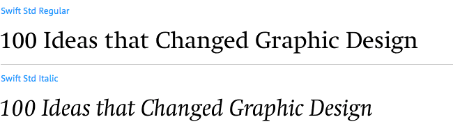
 100 Ideas that Changed Graphic Design, photo via The Salt Lab
Thoughts on Design (reissue edition, 2014), by Paul Rand, foreword by Michael Bierut
— Bodoni Book (Giambattista Bodoni, Morris Fuller Benton)
(I've not seen the original 1947 edition, but I think it was set using a different typeface. Do you know?)
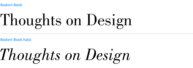
 Thoughts on Design, photo via Khoi Vinh
Popular Lies About Graphic Design (2013), by Craig Ward
— Garamond Pro (Adobe) and Futura Medium (Linotype)

 Popular Lies About Graphic Design, photo via Anna
---
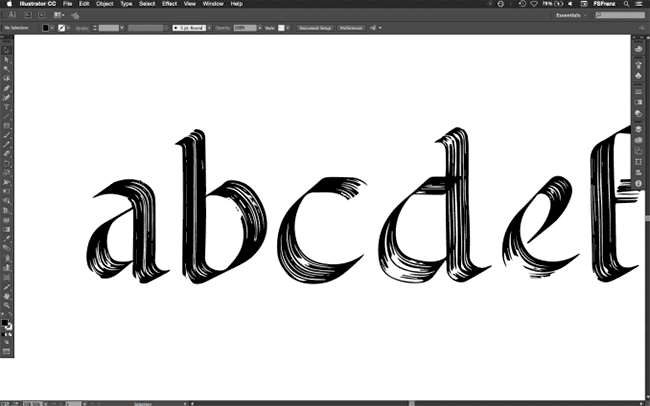
Elsewhere, the Fonts In Use site is a nice resource, and the typeface combinations from the Explorations in Typography book are interesting.
“The possibilities for combining two typefaces are endless, however, a basic guideline to start with is to select 1) a serif and a sans that 2) have similar shapes. To find typefaces with similar shapes, look for ones designed by the same designer or created during the same era.”
Tim Brown wrote a short book called Combining Typefaces. And pairing typefaces in book design is a relevant read from the archives.
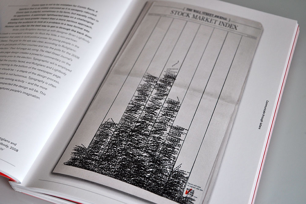 Julie Rutigliano and Brian Lightbody, 2008, Rock the Vote
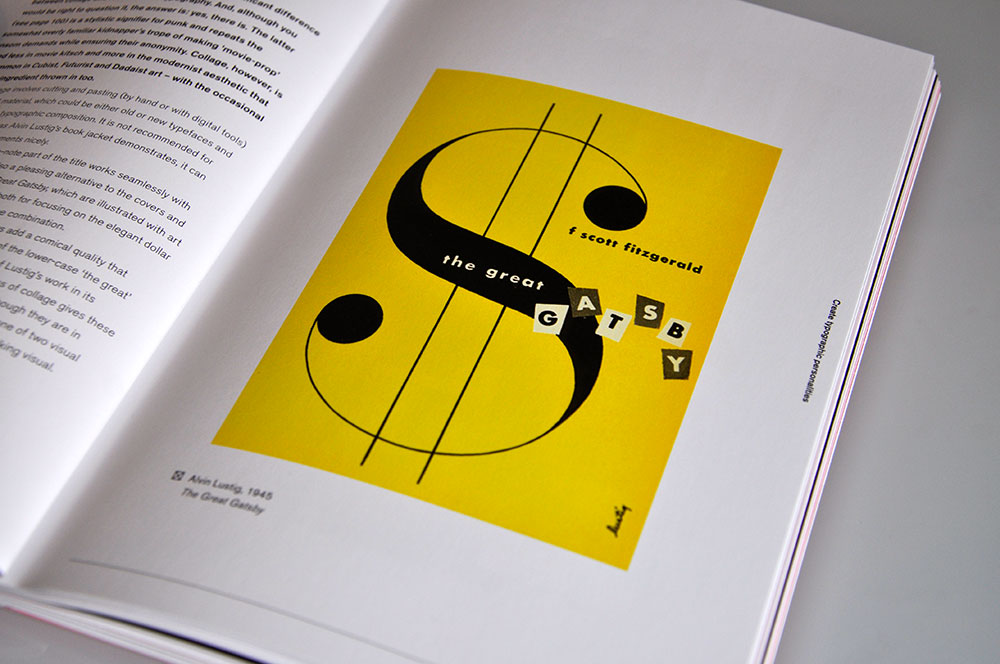 Alvin Lustig, 1945, The Great Gatsby
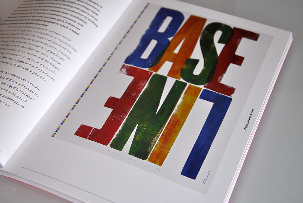 Alan Kitching, 1999, Baseline magazine
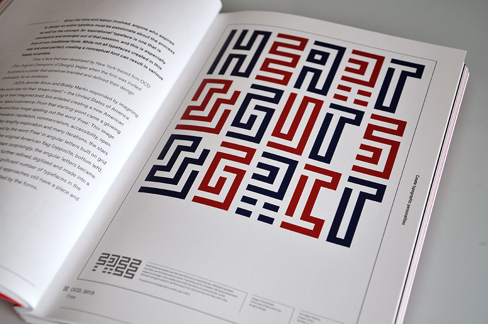 OCD, 2013, Free
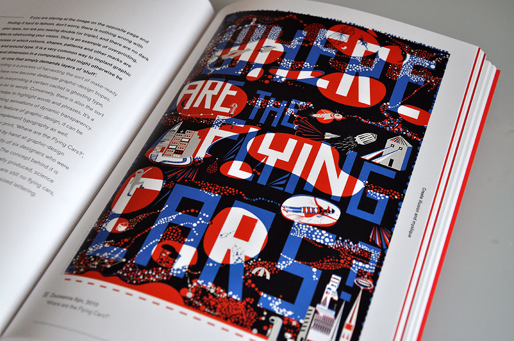 Zsuzsanna Ilijin, 2010, Where are the Flying Cars?
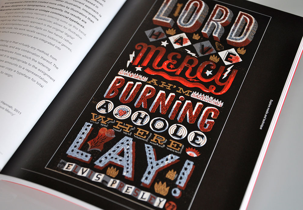 Jonny Hannah, 2011, Lord Have Mercy
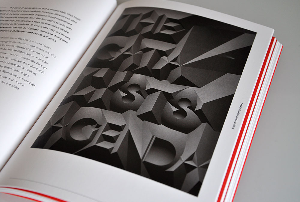 Michiel Schuurman, 2010, The Catalyst’s Agenda
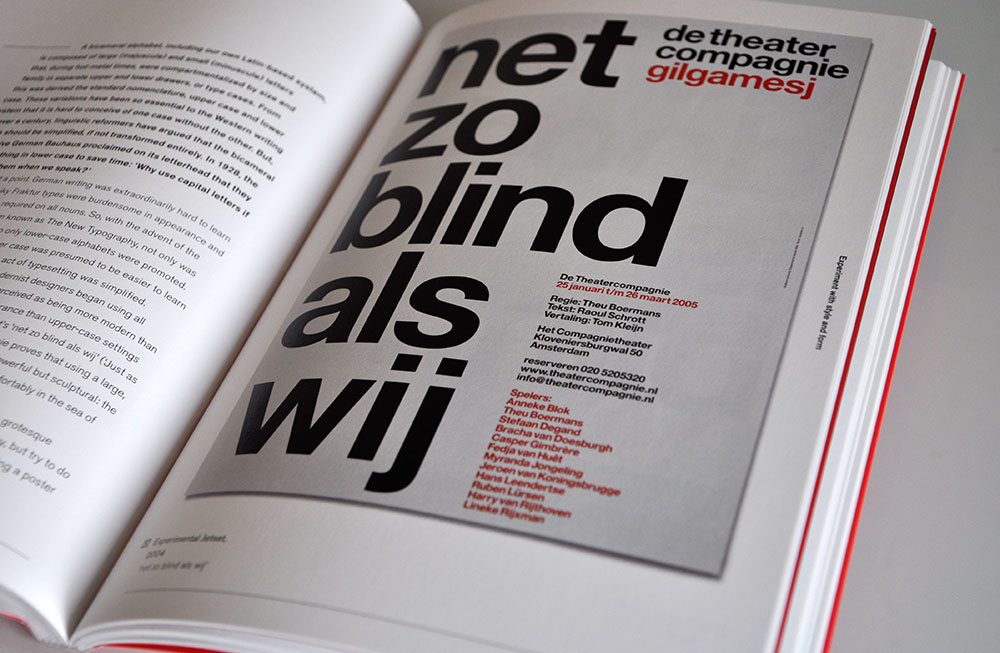 Experimental Jetset, 2004, net zo blind als wij
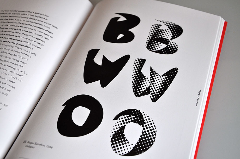 Roger Excoffon, 1958, Calypso