Swiss type designer Adrian Frutiger died on September 12th, 2015, after a lifetime of creating some of the most useful and highly regarded typefaces in the world.
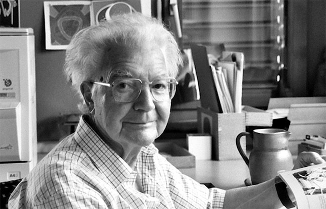 Photo by Henk Gianotten.
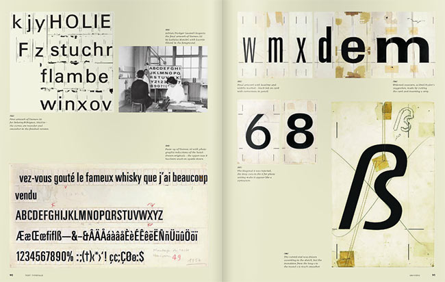
With a client list featuring the likes of IBM, Air France, and the Swiss Post Office, Frutiger’s typefaces include Univers, Avenir, and the self-named Frutiger (among plenty of others), and he has been heralded as the best type designer of the 20th Century.
Adrian Frutiger passed away on 12 September 2015. We lost a worldwide champion of type design. http://t.co/I00LWF7iM6 #frutiger
— Typofonderie (@typofonderie) September 12, 2015
We’ve lost Adrian Frutiger. He defined contemporary type, and he defined the role of a type designer today. We’ll never forget him.
— Font Bureau (@fontbureau) September 12, 2015
My great hero and friend, Adrian Frutiger, best type designer of the 20th century, died today. His #Univers was a revolution back in 1957
— Prof. Erik Spiekermann (@espiekermann) September 12, 2015
RIP Adrian Frutiger, the greatest and most influential type designer of the 20th century.
— Commercial Type (@commercialtype) September 12, 2015
Street signs in a number of London boroughs are set in Univers Bold Condensed, Switzerland’s road signage uses ASTRA-Frutiger, and station signage on the Paris Metro displays his Métro Alphabet — a tiny fraction of where his work has infiltrated public life.
 Photo by philg@mit.edu.
“On my career path I learned to understand that beauty and readability — and up to a certain point, banality — are close bedfellows: the best typeface is the one that impinges least on the reader’s consciousness, becoming the sole tool that communicates the meaning of the writer to the understanding of the reader.”
Quoted from Adrian Frutiger Typefaces: The Complete Works, available on Amazon.co.uk (out of stock on the .com), and previewed here on ISSUU.
One designer who will most definitely live on through his life’s work.